

Logo Design Project-Live Client
Project Brief:
Design a Logo for a brand based in India, Bangalore, which specializes in profiles which are used for wardrobes and partitions. Their main competitors are Kzone, Veneto, Aristo, but they have an advantage over their competitors based on the pricing and quality of products. The line that defines their brand is "Small Space, Great Wisdom".

The characteristics of a good logo is to be simple, memorable, adaptable and timeless. A logo that can help people connect, A logo that draws the attention the viewer. For this purpose I decided to offer the client with three logo options and my process to design it was as follows.
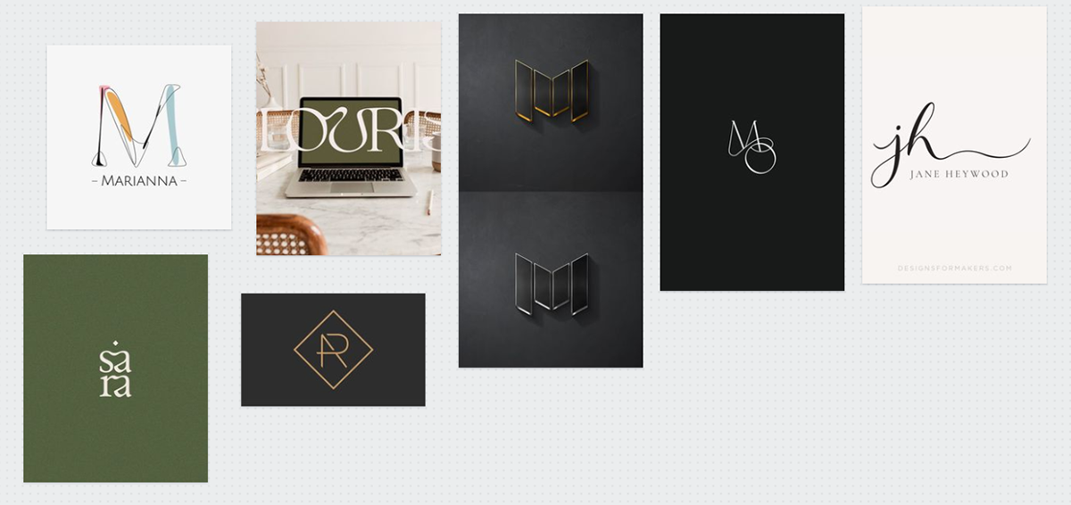
Logo Moodboard
Research.
I asked the client a set of questions to get a clarity of their business and expectations in order to design an appropriate logo, below are the questions and the client responses:
1.What is your brand's unique selling point?
"We specialize in profile which are used for wardrobes and partitions"
2.Who do you think are your brand target audience or main customers or niche?
"We are not retailers, we import the products and sell to shop keepers"
3. Have you taken feedback from your clients as to how do they feel about your products/ pricing? If yes, what do majority of them say?
"They are happy with the product, regarding pricing we are very much competitive"
4. Who do you think are your main competitors in the Market?
"Kzone/Veneto/Aristo are the main competitors but when comes to pricing we are very much reasonable"
5. How are you different from your competitors?
"Pricing"
6. Key message or quote that defines your brand well?
"Small Space, Great Wisdom"
7.Is there a specific reason or story behind naming your brand NMark?
"No"
8.What are the mediums where you generally use your logo or would be using your logo in the future (eg. business cards, brochures, package, on the products etc)
"Yes we will use them where ever required"
Hence based on the above response, My main focus was to keep the logo Minimal, Simple but at the same time attractive and unique such that it created a mark of N and M and also spoke something about what the brand was into (hence I used the element of a wardrobe).


Logo Draft Sketches

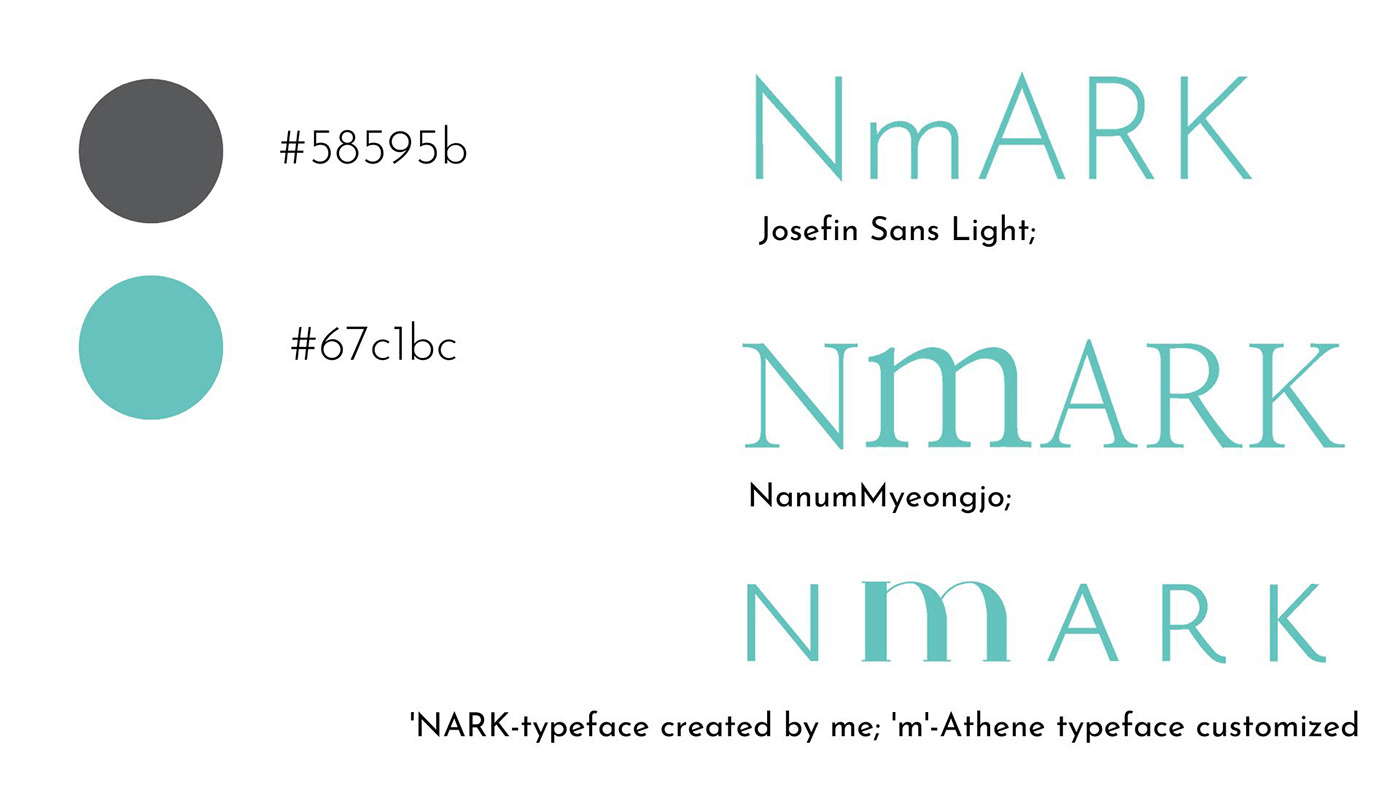
Shades of black and dark grey are often associated with pride, elegance and intelligence, while teal is associated with decency and renovation-Thereby in overall representing 'Small Space, Great Wisdom'
I chose the above typeface to show the brands 'good quality' at the same time 'reasonable' element.

Final Logo Options


Out of all the designs the client liked the two designs as above- the first one for how obviously understandable it was and two for it's style. Hence I tried to combine the two and provided them with the final logo.

Reflective Analysis:
I really enjoyed doing this project. While doing this project I also realized the smaller a brand name the more favorable it is in all ways to the business. I was happy with the logo outputs since they met all the requirements of being 'simple', 'memorable', 'adaptable' and 'timeless', in one of the logo options I also used a typeface created by me, thereby giving it a very unique look to existing brands out there.


